Quantifying gels
Once you have converted the x,y,intensity gel images to linear traces, you can try to convert those traces to relative numbers for each band. Here, resolution becomes essential.
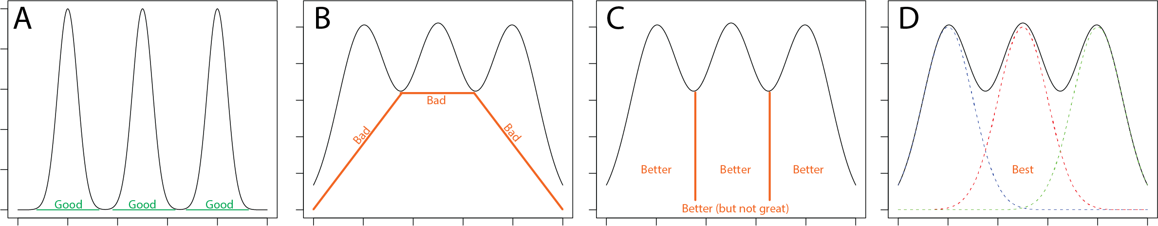
In panel A above, the situation is straightforward and one can integrate (ass) the area under the curve. Easy.
Most gels are not so easy. Let's look at digitized data presented in panels B through D. The simplest solution (panel B) is to draw baselines as shown and then integrate the area between the curves and baseline curves. As you can see, the areas clearly do not represent reality. Indeed, the numbers produced will be lower than reality. Another simple approach is to drop vertical lines to the baseline, as in panel C. Finally, if the bands are relatively few and are well-behaved (those are both very large "ifs"), one can fit the data to a series of Gaussians. This can be a problem for gel data, however - why?
Often none of these is ideal. But you should pick what you think is best, and explain why you used it. If you had other reasons to believer that there was a big "mound" of intensity in the middle that was not relevant to your experiment, then maybe you might try to defend B (go ahead - try!). C might be a reasonable compromise. D requires that you know the nature and number of discrete bands. Perhaps in this case, you could argue for 3, but there could be a 4th, of lower intensity, that you simply can't see evidence for.
In the end, you should plot your original raw data, with numbers overlayed - do they make sense? If the answer is "no," go back to the drawing board. If the answer is "OK," then push yourself to defend that conclusion.