Introduction to Illustrator
The following provides some guidelines to producing precise, attractive, and easy to update figures, using Illustrator (available for free to all graduate students at UMass; sadly, undergraduates can "buy" it for only(!) $20/month). Update: as a result of remote learning initiatives, Illustrator is now available to undergrads as well!). Note that for home use, after your UMass license expires, you might consider Affinity Designer, a less expensive competitor. Much of what you learn here will be useful there.
This tutorial bounces back and forth between topics. The most fundamental and/or the most important topics are listed first. Then some of those topics are re-visited in more detail later.
Some basic principles - why vector graphics?
In the world of images, there are two kinds: bitmapped and vector-based.
Photographs (and gels) are bitmapped - the format specifies a dot (or square) of varying intensity for each pixel. A high resolution photograph might be 6000x4000 pixels. An uncompressed TIF would specify each and every pixel individually, resulting in a very large file.
Add to that the "depth" issue: in an 8 bit bitmapped grayscale image, each pixel can take on 256 levels of gray. That's not much "dynamic range" for science data. We want 16 bit or better (and be careful - you might read a 16 bit file into software and then unknowingly export it as 8 bit, throwing away data!).
For practicality, the default in photography is to "compress" the image by combining nearby pixels that are very close in intensity, in a way that the eye won't notice. And of course, there are levels of compression (low to high) - at high compression the new file might be 10% of the size of the original. High compression means combining/throwing away a lot of pixels. JPG, PNG, and most TIF formats are compressed (AKA "lossy") formats. A gel is meant to be quantitative, so this loss of information is terrible for scientific data.
For gels, ALWAYS work with uncompressed TIF files, and always work with full "depth" files. Basically, always keep the original data file, straight from the instrument. If you need to export as TIF, be sure to export at the highest depth supported (well, not higher than the collected data) and always export as uncompressed TIF. Never export as JPG or PNG (unless it's for unquantitative quick and dirty analysis, like in Trello).
Vector graphics takes a different approach. Perhaps the straight line part of the arrow is 500 pixels across by 5 pixels down (2500 pixels, bitmapped). In vector format, the line part would be specified by just five numbers: the starting x,y coordinates, the ending x,y coordinates, and a number specifying the thickness of the line (and information on color, where appropriate). The beginning and ending x,y coordinate sets are called anchor points. There are similar algorithms for expressing the arrowhead type and size.
For the circle, one would specify the center point x,y coordinates, the radius, and the thickness.
There are several advantages to the vector format: 1) specifying the line part of the arrow above requires 5 parameters, instead of 2500, 2) re-sizing an image is trivial (no matter the resolution, the geometric math remains the same), and 3) it's easy to move the object (arrow or circle) around - simply re-specify the starting and/or ending points by dragging and dropping (the arrow is an object rather than a collection of pixels). It's the last two items that are very important for us. Once a line is established in a bitmapped format, the only thing you can do is erase it and start over. And if it overlaps something else, erasing can be incredibly hard. Moving (or deleting) a vector object is trivial.
Finally, journals often require or strongly prefer files in Illustrator format (or in its closely related and interchangeable sister format, EPS). Consequently, all figures for papers must be prepared in Illustrator. If you use Illustrator for everything (presentations, mock ups, etc) along the way, you're all set to move those figures over to journal ready status.
Common bitmapped file types: JPG (or JPEG). PNG, GIF, TIF (or TIFF), RAW. JPG (and RAW) are typically used for non-science photographs - people, landscapes, etc, where backgrounds are complex textures, etc. In principle, PNG and GIF are optimized more for "graphics" - circles, arrows, etc, with lots of pure, single color background. In practice, there is often little difference.
Common vector graphic file types: PDF, EPS, PS, AI, SVG (note that vector graphic files may contain bitmapped images placed within)
Still more basics
We saw above how circles and lines can be generated mathematically in vector format. What about more complicated shapes? The curved arrow illustrates how. In the example here, each anchor point has an additional feature - a slope (a tangent line)! For each, the tangent line drawn in blue specifies the instantaneous slope at the anchor point. The subtle behavior of the curve now depends on the two anchor points and the two slopes. An algorithm fills in between the anchor points, while maintaining the instantaneous slope at each anchor point. Since the slope is at an angle to the (imaginary) line between the points, the curve follows that slope up - at least initially. It is then drawn back down to meet the requirement at the other anchor point.
But how does that algorithm weight "slope competition" in between points? The lengths of the bars defining the slopes determines the weighting. The slope bar for the left point is longer than that for the right point. Consequently, the steepness of that slope persists farther out into the curved line than does the slope for the right point. The resulting curve is asymmetric.
You can vary both the slope and the length of the "slope bar" by selecting the anchor point of interest, and then grabbing its corresponding slope handle and dragging. .
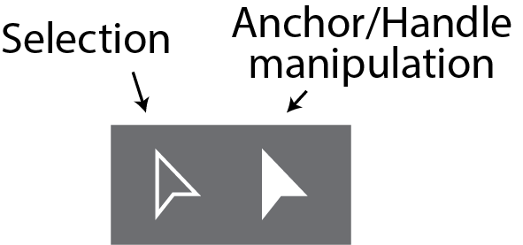
Pointer tools. This is a good place to talk about two tools in Illustrator that often confuse users. The tools at right serve different functions. The hollow Selection arrow is what you might think - it lets you select objects, group them, move them, etc. The other arrow has a more special, but very valuable, function. This is the tool that lets you move anchor points within an object and grab the handles described above. Do not use this if you want to do something to an entire object.
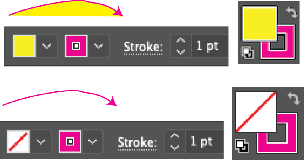
Fill, line, and stroke. Stroke refers to the thickness of a line, usually expressed in pts. The color of the stroke (line) and is specified by the second of the two color boxes. For anything with an arc to it, one can also specify the "fill" color that lies inside the arc/shape - specified by the first of the color boxes. In the lower case shown, there is NO fill (specified by the hashed line in the box). This is what we would typically be usingText
Text
An important word about text. Text boxes can be created to contain text and it works almost like you're used to in other programs. Why do I say "almost?" If you simply click and start typing, you will create "Point Type" - you don't want this (to see why, try it and then try resizing the box).
Instead, you should always choose the type tool and then click and drag to create a box ("Area Type"), THEN you can start typing. This creates a text box, which can be resized, without distorting the text. Within that box, you can align left, center, right - again as you're used to.
Note that under the "Type" menu, there is a context-sensitive command to convert Point Type to Area Type, and vice versa. You always want Area Type.
NEVER use spaces or tabs to position text. When laying several labels in a figure, for example, labels above lanes on a gel, always specify each label separately and place it in position manually (and use align/distribute to make it look professional). NEVER position one text element relative to another by inserting spaces or tabs. Different fonts (even for the same font on different machines) take up slightly different amounts of space. So what aligns perfectly on your computer will not necessarily align on another computer.
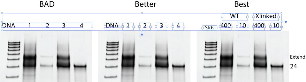
In the first situation above, a single text box is used, and the labels are spaced using spaces or tab - never do this. The second example is much better. Each label is it's on text box. As an aside, the right-most example is the best. Instead of numbering the lanes, useful information is provided in the headers. Whenever possible/practical, follow the model in the right-most example.
Placing (importing/inserting) gels. To add a gel or other external data to an Illustrator file, use the "Place" command, under the "File" menu. Select the file and then click where you want the image to go in your Illustrator document. It will almost certainly be the wrong size, but you can adjust that.
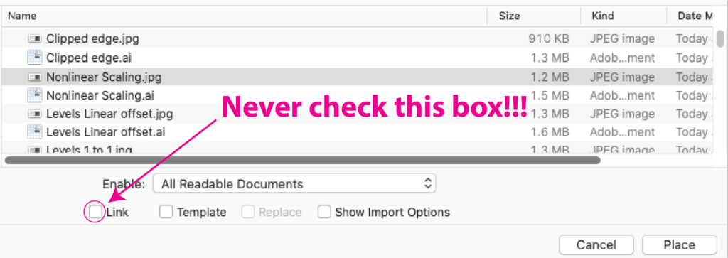
It is very important that, in the file selection dialog box, you do not check the "Link" checkbox.
Once you the gel where you want it, it's often useful to "lock" it in place, using the "Object >> Lock >> Selection" menu item. To unlock one item, you have to unlock everything using the "Object >> Unlock All" item, so lock things with care.
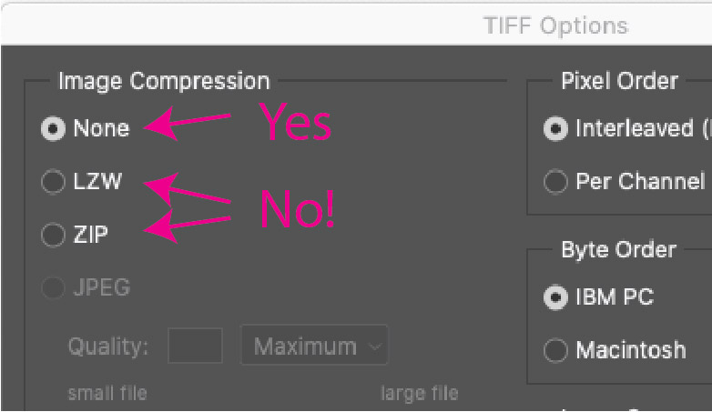
Returning to gels. To re-state a point made above, all scientists have to be very careful never to analyze gels that have been compressed. The compression algorithms (LZW, Zip, et al.) literally delete information, trying to reduce file size, while keeping photographs (of people, landscapes, etc) pleasing to the eye. Although we want our gels to look nice, we should never distort reality in that pursuit. Quantification from compressed gels will be wrong!
Even with uncompressed gels, there are distinct rules about what you can and cannot do in manipulating gels for publication. You'll see an intensity scaling box like that below right, in many programs (this one is from PhotoShop).
- Linear scaling of intensity is generally allowed.
- Nonlinear scaling is NEVER allowed.
What does this mean?
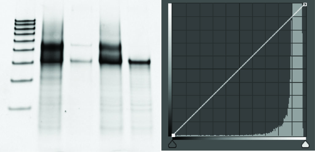
The gel above is an un-manipulated image, straight from the imager (or at least we'll assume that it is for the purposes of this exploration). The graph at the right reflects "before" on one axis and "after" on the other. It is a common tool found in many graphics programs, including Photoshop. In this case intensity 5603 on the y-axis maps to 5603 on the x-axis.
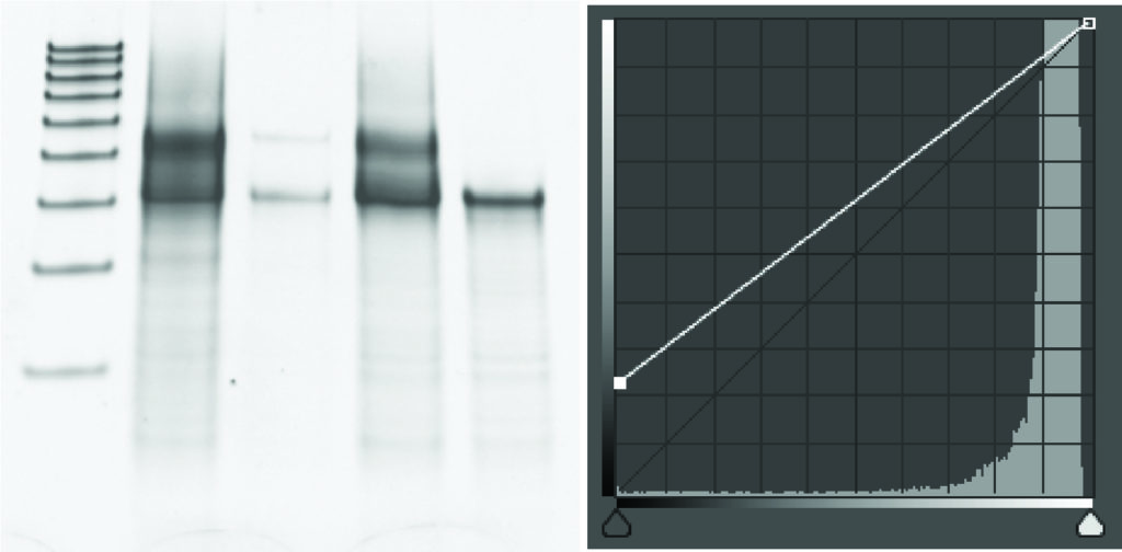
In the above, the gel has been manipulated in such a way that 5603 on the y-axis maps to 4234 on the x-axis. It has been altered by a linear factor. But all points have been manipulated by that same manipulative factor, so the relative ratios of different intensities remains the same. It is a linear mapping. Instead of 1:1 as above, it's 1:0.75 mapping - everywhere.
Well, it's a linear mapping almost everywhere. Note that a large number of y-axis values, at the darkest limit, now map to a single value (still darkest) on the x-axis. If your entire gel is very light and you are trying to darken it, this will work - as long as none of the pixels on your gel are darker than this threshold. So be careful!
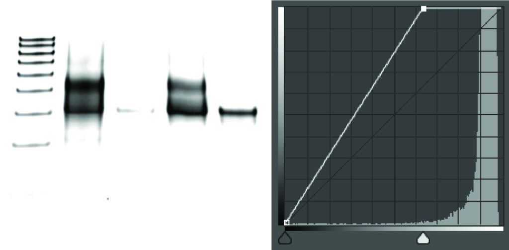
The next manipulation is similar to the last, except that a range of the lowest intensity pixels are all mapped to white. While it is also a linear mapping, the differences between shades of light pixels is completely lost. In the image, you can see that all of the grey background has disappeared. Yes, it might look nicer, but this is the equivalent of taking an eraser out and erasing faint, but real, bands. This is an illegitimate manipulation of the gel. It is always good to show a bit of gray in the background so that readers know you haven't erased perhaps embarrassing faint bands.
In this next set, the user has applied a nonlinear mapping. The difference between light pixels is minimized relative to the difference between the dark pixels. This is NEVER allowed, even though you might like the gel image.
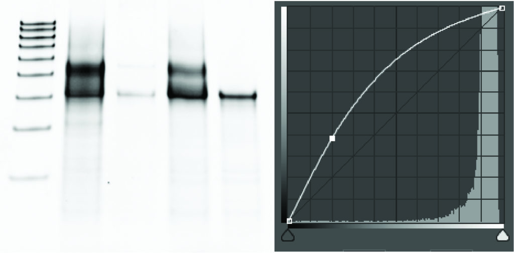
To repeat, any form of nonlinear scaling of gels is NEVER allowed - whether intended or not, it is fraud! Similarly, even linear scaling of gels must be done with appropriate care. This is your responsibility as a scientist.
Beyond the basics
The material above explains pretty much everything you have to know about vector graphics. This next section will give you tips on how best to use Illustrator.
Front / Back. Since everything is an "object" on a page, Illustrator can have some things more "on top" and other things more "on bottom" (as in Powerpoint, et al.). "Object >> Arrange >> Bring to front" puts that object on top of everything else. "Bring to back" does the opposite. So it's always a good idea to send your gel to the "Back" and then lock it there. You can then add annotations on top ("front") of the gel.
Align. This is a very powerful tool in Illustrator and is similar to things you may know about in Powerpoint. Use it for professional looking figures. You'll see in the tool bar" align left, align center, align right, align top, align mid, and align bottom. Most text boxes default to starting the text at the top of the box, so "Align top" is great for aligning text in different text boxes.
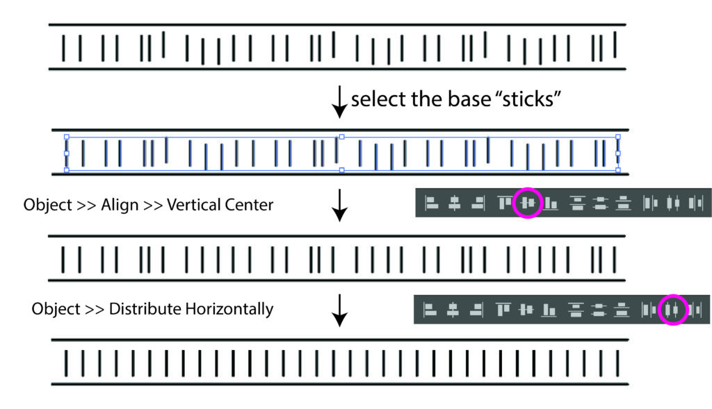
Distribute. This is the lesser known companion to align. Let's talk about how it might be useful in specifying DNA cartoons. Start with the hand drawn DNA duplex shown. The bases are erratic... First, select all of the bases (the vertical sticks) and choose Vertical Align Center. This aligns them all, but they are still spaced erratically. With the bases still selected, choose the Distribute Horizontally tool. Now all of the bases are spaced (distributed) evenly.
You should also use Distribute to evenly spread gel lane labels across the gel. Clearly position the left- and right-most labels, then put the others in between in the right order. You don't need to horizontally position them perfectly. Then use Distribute Horizontally, to space them evenly across the lanes.
Curved lines. We learned above how curved lines are defined - how do we create them in the first place? The pen tool allows this. Think about the desired anchor points and slopes at each anchor point. Choose the "pen" tool and then press down and hold at the first anchor point, then drag your mouse in the direction of the slope you want. Releasing the mouse, then defines that anchor point and slope. Now move to the position of the next anchor point, press down and drag, then release the mouse. Repeat this for as many anchor points as you need. Finally, press "escape" or click on the pen tool to end the curved line definition.
Don't worry if it's not perfect when you first draw your curved line. You can always edit it after creation, as described above.
Where's the square/circle tool? Note in the above, that most of the tool icons have small arrows to their right, facing down and right. This indicates that there multiple tools under that tool. So if you see the circle (ellipse) tool, press and hold on its icon to see a list of related options. The square (rectangle) tool is an alternate option you can choose. Many, many tools have these kind of hidden options.
How to draw a perfect square/circle? The ellipse and rectangle tools let you draw objects with differing x and y dimensions. To create a perfect circle, choose the circle tool, then hold down the option key while dragging - the x and y dimensions will be constrained to be equal, producing a perfect circle. Same for a square, text box, or any other shape.
How to resize an object after it's drawn - manually. Pretty intuitive. Select the object using the selection (hollow arrow) tool, and drag a corner. By default, the line widths, etc inside the thing you are resizing will resize accordingly.
To resize while retaining relative shape dimensions, do as above, but hold down the option key while dragging.
How to resize precisely, with more control. Select the object and choose Object >> Transform >> Scale. You can specify a numeric scale number and choose whether the line widths, etc scale with the scaling.
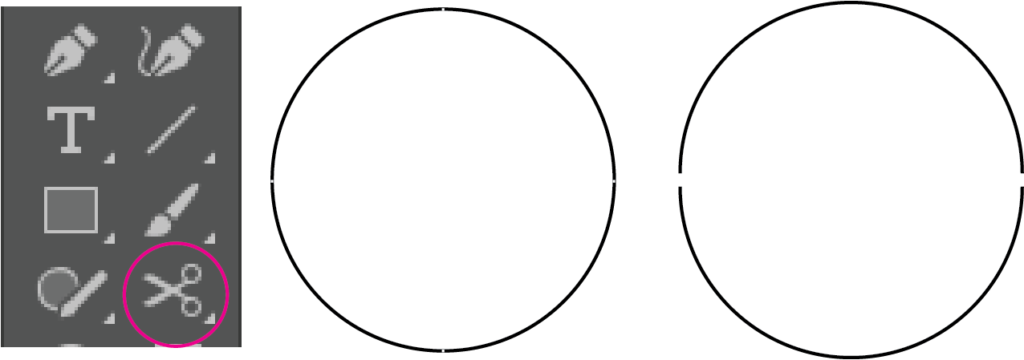
How to make a perfect semi-circle. First draw a perfect circle, by option-dragging using the ellipse tool. Notice that there are four anchor points. Now select the scissors tool, hidden under the eraser tool. With the scissors, click on two of the anchor points to cut the circle. After two clicks, the circle object will now be two semi-circle objects. Delete one of them.
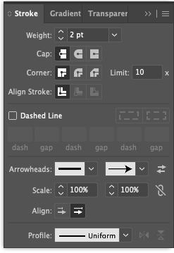
Add an arrowhead to a curved line. Lines and curves in Illustrator are called "strokes." The thickness of a stroke is called its "weight" (you can change this in the stroke pallet or in the ribbon menu).
The Stroke Pallet provides a wealth of changes to strokes. Select a stroke and then toggle on or off a left or a right arrowhead (or both). You can select an alternative style for each arrowhead (see the drop down menu) and you can enlarge or shrink the size (Scale) of the arrowhead relative to its stroke weight (note that the size of the arrowhead scales with the weight of the stroke).
Click on "Dashed line" to turn the stroke into a dashed line. The default is 12 pts of line, followed by 12 pts of gap. Change that by entering numbers in the fields under "Dashed line." You can even do creative things like having the lines be twice the length of the gaps (for this example, set the first two entries to dash=4 pts, gap=2 pts).
Fonts
Fonts and DNA/RNA sequences. Most modern fonts use characters that are "proportionately" spaced. In other words, a narrow "i" takes up less space on a line than a wide "w" - this just looks nice. But if you want to represent sequences of two complementary strands of a DNA duplex, this presents a problem, as "A" "C" "G" and "T" are all slightly different widths.
AAAAAAAAAACCCCCCC
TTTTTTTTTTGGGGGGG
To solve this problem, ALWAYS use a monospaced font when representing DNA or RNA. In monospaced fonts, all characters take up exactly the same horizontal space, and everything lines up perfectly.
Common proportional fonts
- Helvetica
- Arial
- Calibri
- Times
- Palatino
- many, many more...
Common monospaced fonts
- Menlo
- Monaco
- Courier
- American Typewriter
- Geneva
- see more at Wikipedia
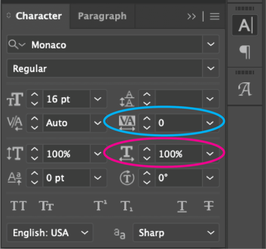
In order for DNA and RNA sequences to align properly, you must use a monospaced font. Additionally, in Illustrator be sure that tracking is set to 0 and horizontal scale is set to 100% for all characters in the sequences.
Fonts - Greek characters, math symbols, etc - we are scientists! In the old days, there was a font called "Symbol Font" that mapped the regular keyboard letters to special characters. Thus, when one typed 'a' you would see an alpha. This led to issues in that not all computers had a symbol font, or had the same symbol font.
The preferred approach now is to no longer use the symbol font, but instead, to use different "keyboards" to introduce the new character (or "glyph"). As an aside, the old ASCII code associated a (hexadecimal) number value with a character, but only allowed for a total of 127 different characters in a font - enough for all upper and lower case letters, numbers, and few symbols, but not many - hence the need for a special font. Modern computers use a replacement called Unicode that allows for a ridiculously large number of characters in a given font. So using Unicode, you can ask for a greek alpha within Helvetica, and when you decide to change to Arial, it still shows up as a greek alpha - no symbol font at all. Even if someone substitutes a font, it will still show up as alpha.
In Illustrator, you can access the Glyphs panel (Window > Type > Glyphs) to insert special characters.
More generally, for ANY program, on Macintosh computers, you can access the different unicode characters using different virtual (system-wide) keyboards. If you haven't already, go to "System Preferences -> Keyboard" and enable "Show keyboard and emoji viewers in menu bar." The menubar should now show an American flag next to "U.S." Next, within the Keyboard preference window, go to the "Input Sources" tab. If you don't have a Greek keyboard, click on the "+" icon, select "Greek - polytonic" and add it. Now your menubar should show "Greek" as an option alongside "U.S." This gives you access to more of the Unicode characters in your favorite font.
Now whenever you want to insert a greek character, go to the menubar and select "Greek" and then type the key you need (mercifully, alpha maps to the "a" key, but you'll have to poke around otherwise - or look in the preferences tab and you'll see a keyboard with the new mappings). You then need to switch back to "U.S." to go back to regular characters.
>>> Can someone provide me with some verbiage on how to do the above on Windows computers? Any of you who regular use other character sets will know how to do this....
Getting rid of fonts altogether(!). Sometimes my installation of "Helvetica" is slightly different from yours (maybe it's a Windows/Mac thing, or maybe your computer is 20 years old). To resolve this issue, some journals want you to convert all text in a figure to graphics (warning: you can go in this direction, but once each character is converted to a graphic, it is no longer "text" that can be edited - you can't go back, so save a different version at this step).
To convert text to graphic, select a block of text and then go to the "Type" menu and select "Create outlines." You'll see that your text is now a bunch of bezier curves that will now resize, etc just like the bezier graphics we have discussed above. It will show up exactly the same on all computers and no one needs to have your font installed at all - it's no longer text!